As businesses look to expand their digital presence, website layout becomes an important aspect to consider. A well-designed website can help improve user experience, engagement, and the overall success of the business. There are many different types of layouts available for websites, each with its unique advantages. From one-page sites to multi-page designs with multiple columns and navigation menus, there is a wide range of website layout options for creating a website. One must need to know the differences between them to make a firm decision about what type of layout is best suited for your business needs.
Let’s take a look at some of the best website layouts out there. It's important to choose a website layout that is customized to your needs and easy to navigate.
Top 10 Types of Website Layouts
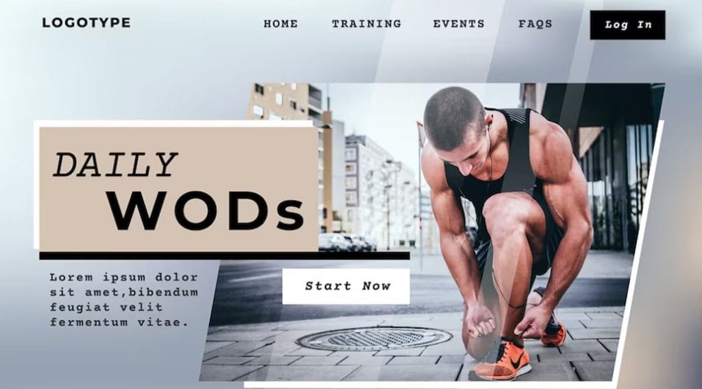
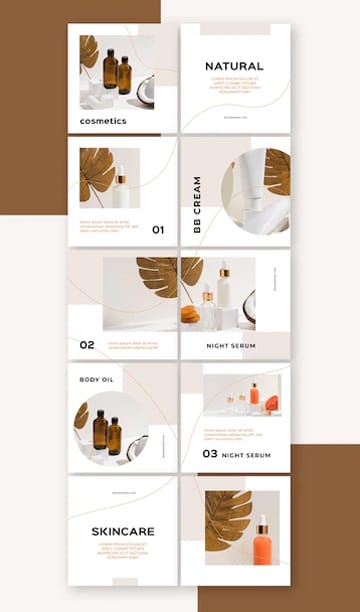
Zig-Zag Layout
The Zig-Zag layout is quickly becoming one of the most popular web design trends. This type of layout is characterized by different areas of content being arranged in a zigzag pattern across the page, creating an eye-catching visual effect.
With its unique design, the zigzag layout can help to create a dynamic and engaging user experience. It allows for more creative freedom when it comes to organizing content, giving designers more opportunities to explore various visuals while maintaining a cohesive style.
Furthermore, this layout can be used on both desktop and mobile sites so that users will have consistent experiences no matter what device they are using. Not only does this design approach offer users an attractive experience, but it also helps to create structure and direction when navigating a website.
F Layout
The F layout is an effective way to organize content on websites and ensure users have the best possible experience. It encourages a balanced approach to the user interface, which can be beneficial in both marketing and usability contexts.
By introducing order into website design, this layout allows users to easily navigate their way around and quickly find what they are looking for. The F layout divides the website into three sections: the header, body, and footer.
The header typically contains navigation options such as the main logo and menu items. The body displays primary content such as text or images. The footer often includes additional information such as copyright notices or contact details.
This structure helps keep websites organized while providing an intuitive browsing experience for users. Additionally, it can help designers create visually appealing layouts that benefit from hierarchy and balance whitespace.
Full-Screen Photo Layout
Full-screen photo layout is a great way to show off large website images. This layout can fill an entire screen and display detailed, high-quality photos in their full glory. With this layout, visitors can focus on the content of the photo and easily navigate around with certain design elements like arrows and indicators.
The Full-screen photo layout provides website owners with a visually engaging platform for displaying large images as well as other types. It can be used for portfolios, galleries, product highlights, or any other type of presentation that requires larger than standard-size images. The layout also allows users to control how much space each image occupies on the page by adjusting its size accordingly.
With this type of design, users are encouraged to explore the website further as they are presented with an impactful first impression.
Additionally, when paired with effective SEO tactics, such as incorporating alt text for images, you can draw more organic traffic to your site.
Grid Layout
Grid layout allows dynamic and responsive page designs that can accommodate a variety of screen sizes from mobile devices to desktop screens. The use of grid layouts makes it easier for developers to create aesthetically pleasing websites as well as ones that are simple and easy to navigate.
The modern web design trend of using grids relies heavily on CSS technology. CSS allows developers to define the size, position, and presentation of elements within their web pages such as images, text boxes, and navigation menus.
The flexibility enables designers to quickly construct pages with attractive layouts while making sure they stay consistent across multiple platforms. Grid-based designs also reduce the need for complex coding which saves a developer time in the long run.
One-Column Layout
The one-column layout consists of only one column, creating a simple, organized look with minimal distraction. This type of layout offers maximum readability while keeping the focus on the content itself.
The key benefit of a one-column web layout is that it provides an uncluttered experience to users, allowing them to quickly find what they are looking for, without any distractions. This layout works well for mobile devices as it avoids having too much information messing up small screens.
With this design element, designers have more flexibility to create an aesthetically pleasing website or application with minimal effort. This can be especially helpful for businesses that need an optimized website for both desktop and mobile.
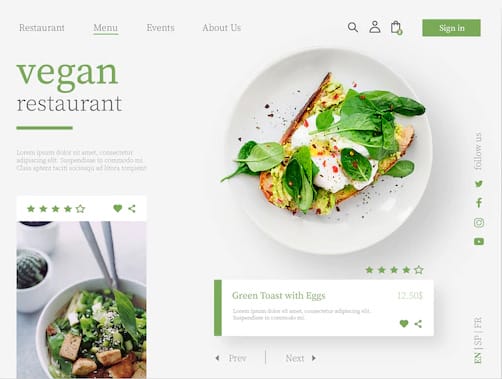
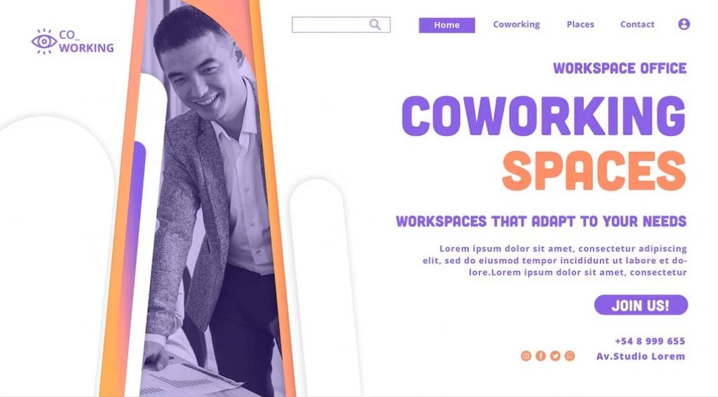
Featured Image Layout
The featured image layout provides a great opportunity to capture attention and help boost website traffic by showcasing key visuals, such as photos and illustrations. This type of layout can be used in conjunction with traditional page layouts to create an eye-catching and effective design.
When designing featured image layouts, it’s essential to ensure that the visual elements are properly balanced. This includes selecting images that are large enough to draw attention but not too large, so they don’t overwhelm other elements on the page.
Our technical experts can help fix any issue you are having with WordPress, regardless of its complexity.
It's important to consider how they will look on different platforms or devices, as well as how they will interact with other page elements and content. By carefully considering these factors, website owners can create a successfully featured image layout that helps their site stand out from the competition.
We, at ForEachNext, are dedicated to helping individuals build their careers in Web development and web designing by providing them with the necessary resources, guidance, and support. Join us
Asymmetrical Layout
An asymmetrical layout uses different elements, such as text and images, arranged in a non-uniform or seemingly random pattern. It can be used to create a visual interest that draws attention to important information or creates a sense of balance across the page.
When used correctly, asymmetry can be aesthetically pleasing and help visitors easily find what they are looking for on the page. It also helps to keep visitors engaged by providing multiple points of focus without overwhelming them with too much information or visuals at once.
Asymmetry can also make a website look more modern and visually appealing compared to traditional symmetrical layouts. Web designers can be more creative with their fonts, colors, and imagery with each section of this layout.
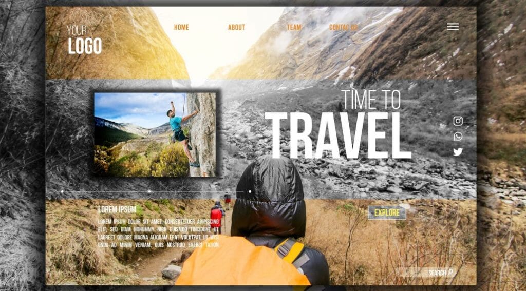
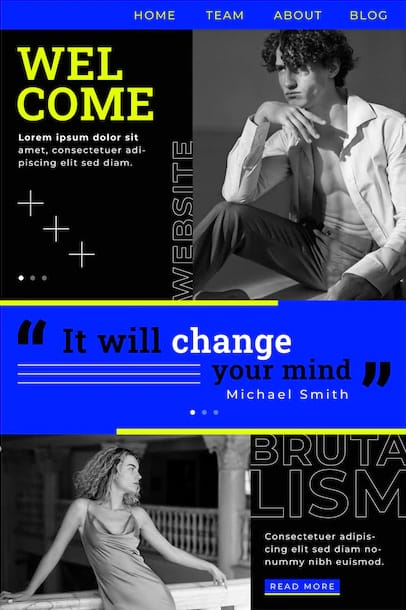
Split Screen Layout
Split screen layout offers designers a fun way to create attractive websites. This style features two columns of content and can highlight multiple pieces of information simultaneously. It also allows users to view different types of content without having to scroll down the page.
The split screen technique can be used in a variety of ways depending on the needs of the designer and user. It can be used for highlighting images or videos side by side; dividing up distinct sections within a page; or creating experiences that transition between two pieces of content as you move from one area to another.
By using this approach, designers can bring together multiple ideas into one unified experience that encourages visitors to stay on their sites longer and engage with more content.
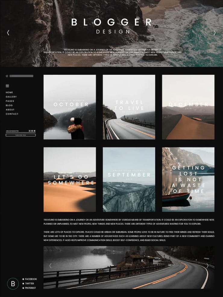
Headline and Thumbnails Gallery Layout
The headline and thumbnail gallery layout uses a combination of large, bold headlines accompanied by relevant images and smaller accompanying text to create an attractive visual design. With this layout, the headlines are designed to be the focal point of the page, drawing attention directly to what you want your viewers to focus on.
By pairing each headline with its thumbnail image, viewers can quickly identify which content they want to read more about. Shorter blocks of text with each headline provide further explanation or context for readers who may not be familiar with the topic at hand.
This type of design allows you to pack multiple pieces of content into one page without overwhelming visitors with too much information at once. This type of layout is ideal for any eCommerce/wooCommerce website.
Card Layout
A card layout uses a design that consists of cards or small tiles that contain images and information in a visually appealing format. Utilizing card layouts helps create responsive websites that are attractive and easy to navigate for users on all devices.
The modern style eliminates clutter from page designs while still providing extra information about different topics with the help of imagery and concise text summaries.
When creating a website with a card layout, it is important to consider how content will be displayed across different screen sizes and resolutions. By taking into account the size of each card as well as the spacing between them, designers can ensure the website looks good regardless of the device used to access it.
Cards should also be grouped into logical categories so that information can be easily found by customers searching for specific topics or products.
Magazine Layout
The magazine layout shows a true magazine identity and value, whilst providing a user-friendly navigation structure that allows readers to quickly find what they are looking for. The main elements of the magazine layout include typography, color schemes, imagery, section headers, and navigation menus.
The chosen font should be readable and easy to scan with a clear hierarchy between titles and subtitles. The color palette should be selected carefully as it can help create the atmosphere within the page. Contrasting colors used in headlines can help draw attention to a key message or story.
Images should be of high quality yet small in size so they don’t slow down the loading speed of the page too much. The overall structure of the page should be straightforward to navigate.
Our technical experts can help fix any issue you are having with WordPress, regardless of its complexity.
Single Page Layout
A single-page layout is a great way to give a website an organized and easy-to-navigate design. It allows users to quickly find and access the information they need without having to scroll down an endless list of pages. This layout also reduces clutter, making it easier for visitors to focus on the content that matters most.
The key to creating a successful single-page layout is utilizing both horizontal and vertical space within the design. By dividing up the page into sections, it’s easier to create a visual hierarchy and guide users toward specific content areas of interest.
Additionally, using anchor links in combination with smooth scrolling makes it easy for visitors to jump between sections of text or images on a single page.
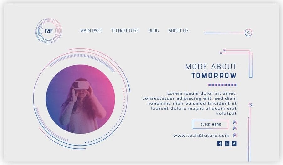
Radial Symmetry Layout
Radial Symmetry is used to create a balanced, pleasing interface by arranging elements in a circular formation around the center of the page. This design approach helps direct users’ attention toward the most important content on the page while providing them with an easy-to-navigate website structure.
A radial symmetry layout can create an even distribution of elements regardless of screen size or orientation. Designers can use this approach to ensure that their site looks consistent across all platforms and devices.
It provides more flexibility when making changes to existing designs since one element can be adjusted without throwing off the entire page’s appearance. Radial symmetry also offers greater room for creativity when creating engaging visuals and interactive features.
Final Take
When designing a website, there are many different types of web layouts to choose from. It is important to consider the purpose and intended audience of the website, as well as other factors such as usability and accessibility when making an informed decision about layout design. The chosen layout should also be tested for responsiveness across multiple devices and browsers. Knowing when to use each type of design can make all the difference in the success of a website.